> ## Documentation Index
> Fetch the complete documentation index at: https://docs.spatius.ai/llms.txt
> Use this file to discover all available pages before exploring further.
# Avatar Background
> How to use the optional 16:9 background asset with an Avatar
An **Avatar Background** is an optional visual companion asset for a Personal Avatar. It is generated from the final photo used to create the Avatar and is intended to be rendered behind the Avatar in your application.
The background does not change the Avatar's 3DGS assets, does not change Motion Server behavior, and does not affect motion data. It is a separate image layer that your client app can display behind the AvatarKit rendering surface.
## Mental model
Treat the background and the Avatar as one fixed stage:
* The background is the **16:9 master stage**.
* The Avatar keeps the same position and scale within that stage.
* Other view sizes are display windows cropped from the same stage.
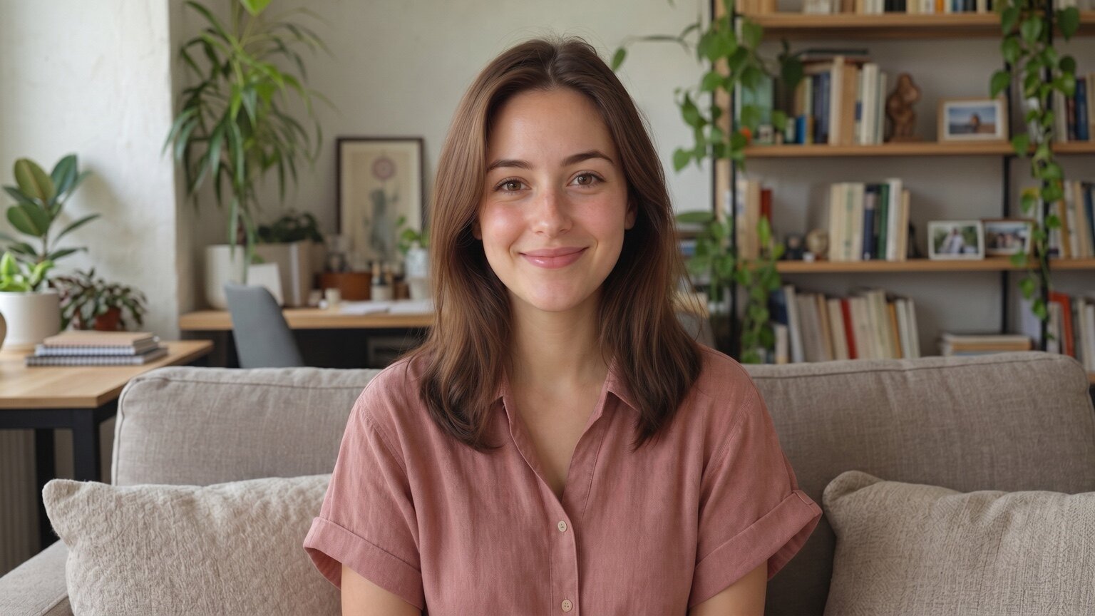 The extracted background asset is the same stage without the Avatar:
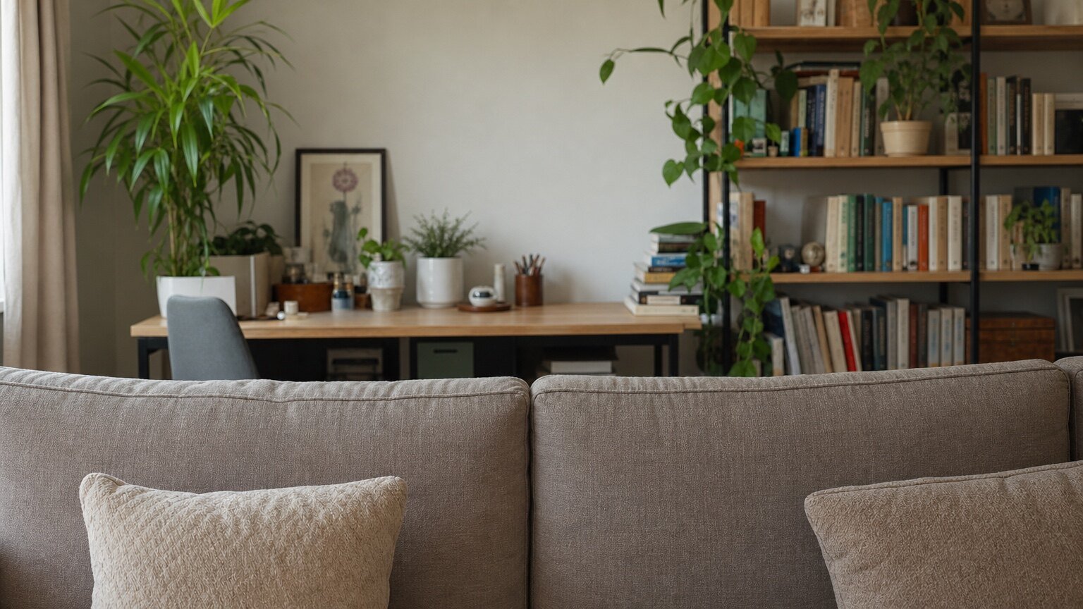 ## Display windows
Use the 16:9 background as the only master image. For square, portrait, or custom containers, crop the visible window from the same stage instead of stretching the image.
| Container | Recommended behavior |
| --------- | -------------------------------------------------------------------------- |
| 16:9 | Show the full background stage. |
| 1:1 | Center-crop from the 16:9 stage. |
| 9:16 | Center-crop from the same stage. Mild shoulder cropping can be acceptable. |
| Custom | Use the same aspect-fill, center-crop rule. |
The Avatar layer and the background layer should share the same container coordinate system. When the container ratio changes, do not move or scale the Avatar independently to "fix" the crop.
Do not stretch, squeeze, or re-center the 16:9 background to match the container. That breaks the spatial relationship between the Avatar and the background.
## What not to do
* Do not use a separate background position for each device ratio.
* Do not zoom or move the Avatar when switching from 16:9 to 1:1 or 9:16.
* Do not use the background asset as part of the avatar assets bundle. Load it as a normal image layer in your app.
* Do not expect the background to preserve physical contact between the original person and nearby objects perfectly.
## Source image limits
The background is generated from a photo that originally contained the person. It works best when the person and background are visually related but not strongly physically coupled.
Avoid depending on the background for cases where the original photo must preserve exact contact details, such as:
* the person pressing into a sofa or chair
* visible body shadows that must line up exactly
* hands or arms resting on a table
* clothing or hair occluding detailed background objects
In those cases, the extracted background can still be useful, but the reconstructed contact area may not look identical to the original photo.
## Next steps
Understand how Avatar IDs and avatar assets work.
See where the Avatar is loaded and rendered in your app.
Check the Web AvatarKit rendering APIs.
## Display windows
Use the 16:9 background as the only master image. For square, portrait, or custom containers, crop the visible window from the same stage instead of stretching the image.
| Container | Recommended behavior |
| --------- | -------------------------------------------------------------------------- |
| 16:9 | Show the full background stage. |
| 1:1 | Center-crop from the 16:9 stage. |
| 9:16 | Center-crop from the same stage. Mild shoulder cropping can be acceptable. |
| Custom | Use the same aspect-fill, center-crop rule. |
The Avatar layer and the background layer should share the same container coordinate system. When the container ratio changes, do not move or scale the Avatar independently to "fix" the crop.
Do not stretch, squeeze, or re-center the 16:9 background to match the container. That breaks the spatial relationship between the Avatar and the background.
## What not to do
* Do not use a separate background position for each device ratio.
* Do not zoom or move the Avatar when switching from 16:9 to 1:1 or 9:16.
* Do not use the background asset as part of the avatar assets bundle. Load it as a normal image layer in your app.
* Do not expect the background to preserve physical contact between the original person and nearby objects perfectly.
## Source image limits
The background is generated from a photo that originally contained the person. It works best when the person and background are visually related but not strongly physically coupled.
Avoid depending on the background for cases where the original photo must preserve exact contact details, such as:
* the person pressing into a sofa or chair
* visible body shadows that must line up exactly
* hands or arms resting on a table
* clothing or hair occluding detailed background objects
In those cases, the extracted background can still be useful, but the reconstructed contact area may not look identical to the original photo.
## Next steps
Understand how Avatar IDs and avatar assets work.
See where the Avatar is loaded and rendered in your app.
Check the Web AvatarKit rendering APIs.